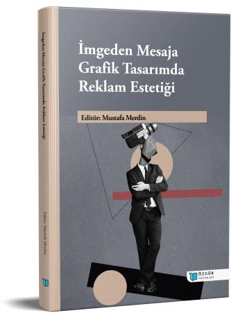
Microtypography and Readability: New Forms of Digital Reading in the Gaming World
Chapter from the book:
Merdin,
M.
(ed.)
2025.
From Image to Message: Advertising Aesthetics in Graphic Design.
Synopsis
This chapter examines the transformation of reading practices in the digital age through the lens of microtypography. Unlike traditional typography, digital typography operates not only as a visual arrangement but also as a cognitive system that guides user behavior. Reading on mobile devices—shaped by limited screen space, variable lighting conditions, and tactile interaction—has elevated the importance of microtypographic decisions. Adjustments at the micro level, such as letter spacing (kerning), line height (leading), and alignment, determine not only readability but also user comfort and interaction rhythm.
This microtypographic sensitivity is reproduced in gaming interfaces, which share similar spatial and cognitive conditions with mobile environments. Within games, microtypography functions as an invisible system that shapes players’ attention, reaction time, and perceptual comfort.
Microtypography has become an architectural framework of perception and interaction within digital culture. With the emergence of AI-driven adaptive typography, it is expected to evolve into a dynamic system that interacts with user data. Each pixel, space, and alignment decision thus forms a neuro-ergonomic infrastructure defining how digital information is perceived and experienced.

